ShopDreamUp AI ArtDreamUp
Deviation Actions
![Avant Skin [Now Available]](https://images-wixmp-ed30a86b8c4ca887773594c2.wixmp.com/f/ed6e2e69-965d-4e55-8e45-91777a976b40/d566maw-fdf9dd01-ab11-4972-a712-11e8ef4a2cd6.png/v1/fill/w_345,h_400,q_70,strp/avant_skin__now_available__by_sanguineepitaph_d566maw-400t.jpg?token=eyJ0eXAiOiJKV1QiLCJhbGciOiJIUzI1NiJ9.eyJzdWIiOiJ1cm46YXBwOjdlMGQxODg5ODIyNjQzNzNhNWYwZDQxNWVhMGQyNmUwIiwiaXNzIjoidXJuOmFwcDo3ZTBkMTg4OTgyMjY0MzczYTVmMGQ0MTVlYTBkMjZlMCIsIm9iaiI6W1t7ImhlaWdodCI6Ijw9MTE4NyIsInBhdGgiOiJcL2ZcL2VkNmUyZTY5LTk2NWQtNGU1NS04ZTQ1LTkxNzc3YTk3NmI0MFwvZDU2Nm1hdy1mZGY5ZGQwMS1hYjExLTQ5NzItYTcxMi0xMWU4ZWY0YTJjZDYucG5nIiwid2lkdGgiOiI8PTEwMjQifV1dLCJhdWQiOlsidXJuOnNlcnZpY2U6aW1hZ2Uub3BlcmF0aW9ucyJdfQ.eGmPd1P13IBbKOOJZcswHUAnh_iTEKkKrVUK8UYpIl4)


Suggested Deviants


Suggested Collections


You Might Like…


Description
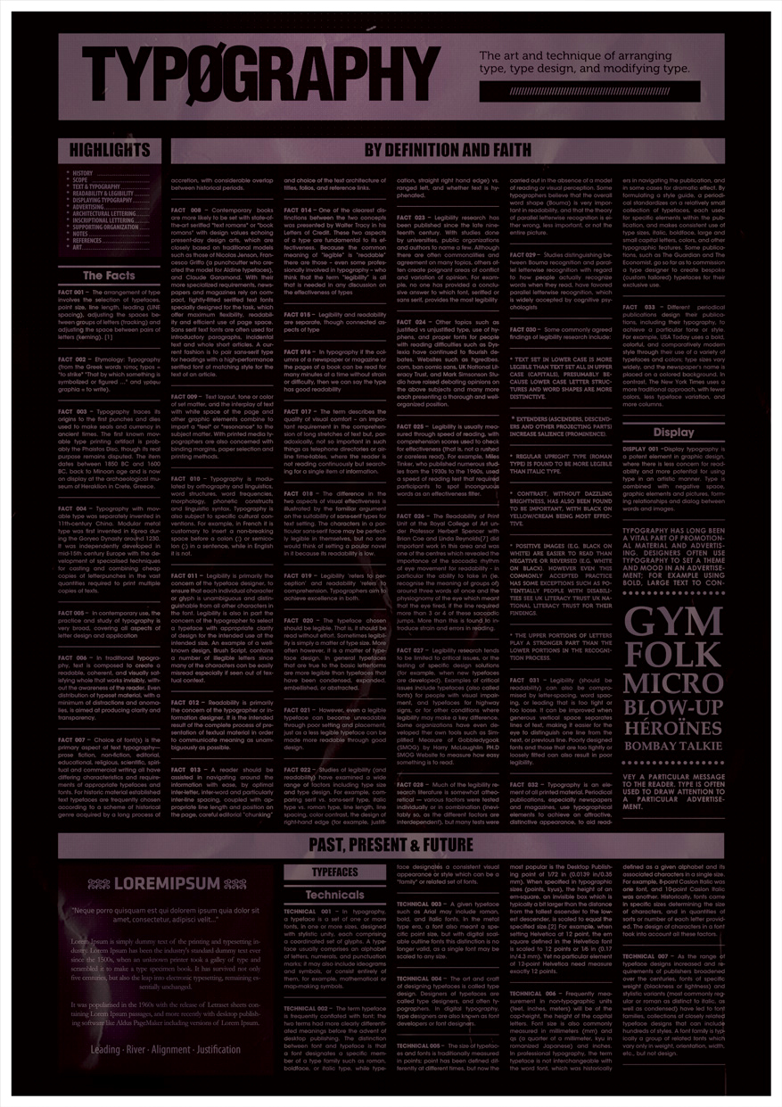
|About:
More posters from a series I´m working on. Maybe you see it a bit dark but it looks fantastic at its original size that is A3.
|Credits:
Texture used is made by =cloaks
© 2009 Roberto Abril Hidalgo | bobbyperux.deviantart.com | teskostudio.com
More posters from a series I´m working on. Maybe you see it a bit dark but it looks fantastic at its original size that is A3.
- The Typeface
The arrangement of type involves the selection of typefaces, point size, line length, leading (line spacing), adjusting the spaces between groups of letters (tracking) and adjusting the space between pairs of letters (kerning).
Etymology: Typography (from the Greek words τύπος typos = "to strike" "That by which something is symbolized or figured …" and γράφω graphia = to write).
Typography traces its origins to the first punches and dies used to make seals and currency in ancient times. The first known movable type printing artifact is probably the Phaistos Disc, though its real purpose remains disputed. The item dates between 1850 BC and 1600 BC, back to Minoan age and is now on display at the archaeological museum of Heraklion in Crete, Greece.
Typography with movable type was separately invented in 11th-century China. Modular metal type was first invented in Korea during the Goryeo Dynasty around 1230. It was independently developed in mid-15th century Europe with the development of specialised techniques for casting and combining cheap copies of letterpunches in the vast quantities required to print multiple copies of texts.
In contemporary use, the practice and study of typography is very broad, covering all aspects of letter design and application
In traditional typography, text is composed to create a readable, coherent, and visually satisfying whole that works invisibly, without the awareness of the reader. Even distribution of typeset material, with a minimum of distractions and anomalies, is aimed at producing clarity and transparency.
Choice of font(s) is the primary aspect of text typography— prose fiction, non-fiction, editorial, educational, religious, scientific, spiritual and commercial writing all have differing characteristics and requirements of appropriate typefaces and fonts. For historic material established text typefaces are frequently chosen according to a scheme of historical genre acquired by a long process of accretion, with considerable overlap between historical periods.
Contemporary books are more likely to be set with state-of-the-art seriffed "text romans" or "book romans" with design values echoing present-day design arts, which are closely based on traditional models such as those of Nicolas Jenson, Francesco Griffo (a punchcutter who created the model for Aldine typefaces), and Claude Garamond. With their more specialized requirements, newspapers and magazines rely on compact, tightly-fitted seriffed text fonts specially designed for the task, which offer maximum flexibility, readability and efficient use of page space. Sans serif text fonts are often used for introductory paragraphs, incidental text and whole short articles. A current fashion is to pair sans-serif type for headings with a high-performance seriffed font of matching style for the text of an article.
Text layout, tone or color of set matter, and the interplay of text with white space of the page and other graphic elements combine to impart a "feel" or "resonance" to the subject matter. With printed media typographers are also concerned with binding margins, paper selection and printing methods.
Typography is modulated by orthography and linguistics, word structures, word frequencies, morphology, phonetic constructs and linguistic syntax. Typography is also subject to specific cultural conventions. For example, in French it is customary to insert a non-breaking space before a colon ( : ) or semicolon ( ; ) in a sentence, while in English it is not.
Legibility is primarily the concern of the typeface designer, to ensure that each individual character or glyph is unambiguous and distinguishable from all other characters in the font. Legibility is also in part the concern of the typographer to select a typeface with appropriate clarity of design for the intended use at the intended size. An example of a well-known design, Brush Script, contains a number of illegible letters since many of the characters can be easily misread especially if seen out of textual context.
Readability is primarily the concern of the typographer or information designer. It is the intended result of the complete process of presentation of textual material in order to communicate meaning as unambiguously as possible.
A reader should be assisted in navigating around the information with ease, by optimal inter-letter, inter-word and particularly inter-line spacing, coupled with appropriate line length and position on the page, careful editorial “chunking” and choice of the text architecture of titles, folios, and reference links.
One of the clearest distinctions between the two concepts was presented by Walter Tracy in his Letters of Credit. These two aspects of a type are fundamental to its effectiveness. Because the common meaning of “legible” is “readable” there are those – even some professionally involved in typography – who think that the term “legibility” is all that is needed in any discussion on the effectiveness of types
Legibility and readability are separate, though connected aspects of type
In typography if the columns of a newspaper or magazine or the pages of a book can be read for many minutes at a time without strain or difficulty, then we can say the type has good readability
The term describes the quality of visual comfort – an important requirement in the comprehension of long stretches of text but, paradoxically, not so important in such things as telephone directories or air-line time-tables, where the reader is not reading continuously but searching for a single item of information.
The difference in the two aspects of visual effectiveness is illustrated by the familiar argument on the suitability of sans-serif types for text setting. The characters in a particular sans-serif face may be perfectly legible in themselves, but no one would think of setting a poular novel in it because its readability is low.
Legibility ‘refers to perception’ and readability ‘refers to comprehension. Typographers aim to achieve excellence in both.
The typeface chosen should be legible. That is, it should be read without effort. Sometimes legibility is simply a matter of type size. More often however, it is a matter of typeface design. In general typefaces that are true to the basic letterforms are more legible than typefaces that have been condensed, expanded, embellished, or abstracted.
However, even a legible typeface can become unreadable through poor setting and placement, just as a less legible typeface can be made more readable through good design.
Studies of legibility (and readability) have examined a wide range of factors including type size and type design. For example, comparing serif vs. sans-serif type, italic type vs. roman type, line length, line spacing, color contrast, the design of right-hand edge (for example, justification, straight right hand edge) vs. ranged left, and whether text is hyphenated.
Legibility research has been published since the late nineteenth century. With studies done by universities, public organizations and authors to name a few. Although there are often commonalities and agreement on many topics, others often create poignant areas of conflict and variation of opinion. For example, no one has provided a conclusive answer to which font, seriffed or sans serif, provides the most legibility
Other topics such as justified vs unjustified type, use of hyphens, and proper fonts for people with reading difficulties such as Dyslexia have continued to flourish debates. Websites such as hgredbes.com, ban comic sans, UK National Literacy Trust, and Mark Simsonson Studio have raised debating opinions on the above subjects and many more each presenting a thorough and well-organized position.
Legibility is usually measured through speed of reading, with comprehension scores used to check for effectiveness (that is, not a rushed or careless read). For example, Miles Tinker, who published numerous studies from the 1930s to the 1960s, used a speed of reading test that required participants to spot incongruous words as an effectiveness filter.
The Readability of Print Unit at the Royal College of Art under Professor Herbert Spencer with Brian Coe and Linda Reynolds[7] did important work in this area and was one of the centres which revealed the importance of the saccadic rhythm of eye movement for readability - in particular the ability to take in (ie. recognise the meaning of groups of) around three words at once and the physiognomy of the eye which meant that the eye tired, if the line required more than 3 or 4 of these saccadic jumps. More than this is found to introduce strain and errors in reading.
Legibility research tends to be limited to critical issues, or the testing of specific design solutions (for example, when new typefaces are developed). Examples of critical issues include typefaces (also called fonts) for people with visual impairment, and typefaces for highway signs, or for other conditions where legibility may make a key difference. Some organizations have even developed ther own tools such as Simplified Measure of Gobbledygook (SMOG) by Harry McLaughlin PH.D SMOG Website to measure how easy something is to read.
Much of the legibility research literature is somewhat atheoretical — various factors were tested individually or in combination (inevitably so, as the different factors are interdependent), but many tests were carried out in the absence of a model of reading or visual perception. Some typographers believe that the overall word shape (Bouma) is very important in readability, and that the theory of parallel letterwise recognition is either wrong, less important, or not the entire picture.
Studies distinguishing between Bouma recognition and parallel letterwise recognition with regard to how people actually recognize words when they read, have favored parallel letterwise recognition, which is widely accepted by cognitive psychologists
Some commonly agreed findings of legibility research include:
* Text Set In Lower Case Is More Legible Than Text Set All In Upper Case (Capitals), Presumably Because Lower Case Letter Structures And Word Shapes Are More Distinctive.
* Extenders (Ascenders, Descenders And Other Projecting Parts) Increase Salience (Prominence).
* Regular Upright Type (Roman Type) Is Found To Be More Legible Than Italic Type.
* Contrast, Without Dazzling Brightness, Has Also Been Found To Be Important, With Black On Yellow/Cream Being Most Effective.
* Positive Images (E.G. Black On White) Are Easier To Read Than Negative Or Reversed (E.G. White On Black). However Even This Commonly Accepted Practice Has Some Exceptions Such As Potentially People With Disabilities See Uk Literacy Trust Uk National Literacy Trust For Their Findings.
* The Upper Portions Of Letters Play A Stronger Part Than The Lower Portions In The Recognition Process.
Legibility (should be readability) can also be compromised by letter-spacing, word spacing, or leading that is too tight or too loose. It can be improved when generous vertical space separates lines of text, making it easier for the eye to distinguish one line from the next, or previous line. Poorly designed fonts and those that are too tightly or loosely fitted can also result in poor legibility.
Typography is an element of all printed material. Periodical publications, especially newspapers and magazines, use typographical elements to achieve an attractive, distinctive appearance, to aid readers in navigating the publication, and in some cases for dramatic effect. By formulating a style guide, a periodical standardizes on a relatively small collection of typefaces, each used for specific elements within the publication, and makes consistent use of type sizes, italic, boldface, large and small capital letters, colors, and other typographic features. Some publications, such as The Guardian and The Economist, go so far as to commission a type designer to create bespoke (custom tailored) typefaces for their exclusive use.
Different periodical publications design their publications, including their typography, to achieve a particular tone or style. For example, USA Today uses a bold, colorful, and comparatively modern style through their use of a variety of typefaces and colors; type sizes vary widely, and the newspaper's name is placed on a colored background. In contrast, The New York Times uses a more traditional approach, with fewer colors, less typeface variation, and more columns.
Display typography is a potent element in graphic design, where there is less concern for readability and more potential for using type in an artistic manner. Type is combined with negative space, graphic elements and pictures, forming relationships and dialog between words and images.
Typography has long been a vital part of promotional material and advertising. Designers often use typography to set a theme and mood in an advertisement; for example using bold, large text to convey a particular message to the reader. Type is often used to draw attention to a particular advertisement.
In typography, a typeface is a set of one or more fonts, in one or more sizes, designed with stylistic unity, each comprising a coordinated set of glyphs. A typeface usually comprises an alphabet of letters, numerals, and punctuation marks; it may also include ideograms and symbols, or consist entirely of them, for example, mathematical or map-making symbols.
The term typeface is frequently conflated with font; the two terms had more clearly differentiated meanings before the advent of desktop publishing. The distinction between font and typeface is that a font designates a specific member of a type family such as roman, boldface, or italic type, while typeface designates a consistent visual appearance or style which can be a "family" or related set of fonts.
A given typeface such as Arial may include roman, bold, and italic fonts. In the metal type era, a font also meant a specific point size, but with digital scalable outline fonts this distinction is no longer valid, as a single font may be scaled to any size.
The art and craft of designing typefaces is called type design. Designers of typefaces are called type designers, and often typographers. In digital typography, type designers are also known as font developers or font designers.
The size of typefaces and fonts is traditionally measured in points; point has been defined differently at different times, but now the most popular is the Desktop Publishing point of 1⁄72 in (0.0139 in/0.35 mm). When specified in typographic sizes (points, kyus), the height of an em-square, an invisible box which is typically a bit larger than the distance from the tallest ascender to the lowest descender, is scaled to equal the specified size.[2] For example, when setting Helvetica at 12 point, the em square defined in the Helvetica font is scaled to 12 points or 1⁄6 in (0.17 in/4.3 mm). Yet no particular element of 12-point Helvetica need measure exactly 12 points.
Frequently measurement in non-typographic units (feet, inches, meters) will be of the cap-height, the height of the capital letters. Font size is also commonly measured in millimeters (mm) and qs (a quarter of a millimeter, kyu in romanized Japanese) and inches. In professional typography, the term typeface is not interchangeable with the word font, which was historically defined as a given alphabet and its associated characters in a single size. For example, 8-point Caslon Italic was one font, and 10-point Caslon Italic was another. Historically, fonts came in specific sizes determining the size of characters, and in quantities of sorts or number of each letter provided. The design of characters in a font took into account all these factors.
As the range of typeface designs increased and requirements of publishers broadened over the centuries, fonts of specific weight (blackness or lightness) and stylistic variants (most commonly regular or roman as distinct to italic, as well as condensed) have led to font families, collections of closely related typeface designs that can include hundreds of styles. A font family is typically a group of related fonts which vary only in weight, orientation, width, etc., but not design.
|Credits:
Texture used is made by =cloaks
© 2009 Roberto Abril Hidalgo | bobbyperux.deviantart.com | teskostudio.com
Image size
877x1241px 751.62 KB
© 2009 - 2024 Bobbyperux
Comments26
Join the community to add your comment. Already a deviant? Log In
Would I be able to buy this in the future?